
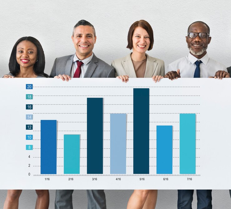
Indicators, a dashboard, a team, a regular meeting with a standard agenda. Here are some of the elements of success in the animation of indicators related to continuous improvement.
After finalizing your first continuous improvement project, you were able to measure the gains using indicators. Since you have finalized and succeeded in this first project, you can roll it out to the entire company. So now is the time for you to start other projects. You were responsible for the indicator for the duration of the project and ensured its compilation. You have measured your success with the indicator.
That’s why one of the challenges you face is to sustain and maintain the improvements made while launching new projects. A good way to do this is to choose a representative indicator for each one, display it and organize an animation to make it come alive.
This article will guide you in the dissemination and animation of the indicators. Because you know how to build indicators.
Set up a table of indicators
It is true that we often tend to forget what we have learned: “good old habits” come back quickly, and even more quickly if we do not monitor objective elements of progress. Transforming an organization takes time. Besides, integrating new practices is tedious. It often takes a year or more to turn a new practice into a routine.
It is important in any improvement project to select indicators that will monitor progress during implementation, but also the maintenance of gains in the months that follow.
The chosen indicator will contain:
- The variable measured and its unit: number of defects per 100 pieces, number of complaints per 1000 products, average response time to customer emails…
- the objective to be achieved,
- The acceptable low and/or high limit. In the Six Sigma methodology, we aim for low variability, the high (and low) range is three standard deviations from the target mean.
To ensure that impacted teams understand the indicators and the impact of their work on the indicators, it is important to share them with them. A numerical indicator, updated by the manager, in her personal files is of no use. Indeed, managers can look at the indicator, but the key people involved do not have the vision and leverage to improve it.
Ideally, the indicator is displayed on a dashboard near the workplace. An employee updates it manually. If it is digital, updates are regular. In the case of manual indicators, it is possible to update them in an electronic file, in order to keep a longer history.
Animate a KPI dahboard
In order for the teams to take ownership of the dashboard and its indicators, it is necessary to organize an animation. It is obvious that when the dashboard is set up, it will generate interest, but after a few days, it will become part of the “landscape” and no one will look at it.
The animation can take place on a daily or weekly basis, depending on how often the indicators are updated. Ideally, the animation should not exceed 15 minutes for a weekly animation, 5 minutes for a daily animation. Of course, animation can be set up twice a week or at whatever frequency suits the teams best.

Structure the animation of an KPI dashboard
The animation takes place around the dashboard of the team’s indicators. Thus, the dashboard can contain indicators for the company, the sector and the team. Here are some tips, topics or organizational methods for structuring the animation:
- Review the previous period (day, week…): what went as planned or better and what were the possible problems encountered,
- Stimulate the team by presenting the challenges of the upcoming period,
- If necessary, remind people of important events planned for the upcoming period,
- Set the pace by presenting different topics each day. For example, on Monday, talk about orders, Tuesday and Thursday about safety, Wednesday about customer satisfaction and Friday about team performance,
- Involve the team: offer the facilitation or presentation of an indicator to a member (which changes every quarter or year). This way, the team will be more involved in understanding the indicators,
- Be flexible in the organization when setting up: find the right time, the right duration and the right frequency. Be clear that these three elements can be adapted when launching the animation,
- Keep flexibility and common sense: not all indicators need to be reviewed at every presentation.