The spaghetti diagram is a tool that gives a clear view of the physical flow of parts or individuals. It also applies to digital flows, with an architecture diagram.
It takes its name from its resemblance to a dish of spaghetti. In general, flows intermingle in its first trace. In general, flows intermingle in its first trace.

This visualization is used to identify redundant flows, recurring crossings and measure the path traveled by each product or person.
It helps to reorganize machines or services geographically. Relocation will reduce travel time and non-added value. The spaghetti diagram can also reduce risk in an area by optimizing movement. Finally, it is a process optimization tool, when you want to reduce cycle time.
Design a spaghetti diagram in 5 steps
1. Define the scope
For a physical process, it’s pretty simple. Depending on your objective: optimize a process, reduce accidents in an area, you start by choosing the department, the workshop or the process you are going to study. You then define the geographical area concerned.
For a virtual process, it is necessary to identify the different people who are part of the process, but also the systems, servers or tools used. If your goal is to optimize the use of a particular resource, define it precisely: is it a server or the connection between two sites?
2. Get a map of the area
The map must contain the different machines or parts in which the products will be processed, as well as the intermediate storage areas.
In a virtual world, we can schematize the different sectors and represent them with dots. We can also indicate on the map the different systems or servers used by the process. This is enough to optimize the work of the teams and to understand the information flow. However, if you are concerned with the use of a resource, you will need a network architecture diagram.
3. List the different types of products or services that are transformed by the process.
This step must be adapted to different sectors. The objective is to inventory everything that is processed, or passes through the identified resource or area. You will then make categories to simplify the next step.
For example, for a hospital, we will list the different types of patients that must be treated: emergency, punctual appointments, outpatient surgery, …
If you work in a factory, you will choose a categorization by product type. For a service company, you can classify your inventory by type of service, client or volume. Finally, for computer resources, it is the type of data or connections that can be used.
The easiest approach is to observe what is going on in the area and then group together. There is no right way to group, you need to find common characteristics that will simplify the next step.
4. Draw for each product the path taken
You need to have as many stakeholders as possible in the design. In fact, there is nothing more complex than to imagine what happens in another sector or service. Ideally, before getting into the drawing, the team will “walk” the process during a Gemba Walk.
If you don’t know how to group your inventory, you can use an empirical approach. You will follow products, customers or employees, either really or virtually. For each one you will draw the “path” taken on your map. Don’t forget to indicate storage or waiting areas.
After a few rounds, you will notice that some paths are more used than others. That’s what categorization is all about. If all the type A patients follow the same path, you can follow one and make a thicker line to represent the volume.
5. Mesure to improve
It’s finally time to measure. Depending on your initial objective, you will measure the distance traveled by each type of product, by employees or patients. You can also measure the traffic at a particular point. This is especially important if you want to address congestion in an area.
This measure will be used to compare the initial situation with the proposed change, and to calculate the cost-effectiveness of the changes. In the virtual space, we can count the number of steps, or the number of kilometers of network cable used. For capacity optimization it is the volume of data transiting (or stored) at a point that can be measured.
Examples of spaghetti diagram
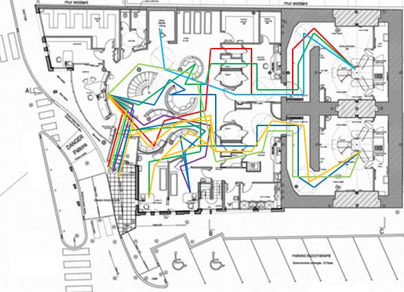
X-Ray center (plan copyright : Atelier Hall Idasiak)
In this case, it is the flow of patients that is represented. But we could also have worked on the flow of employees. It all depends on the objectives of the study. A good 5W’s will ensure that the study is about the right topic.
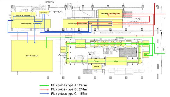
Factory workshop